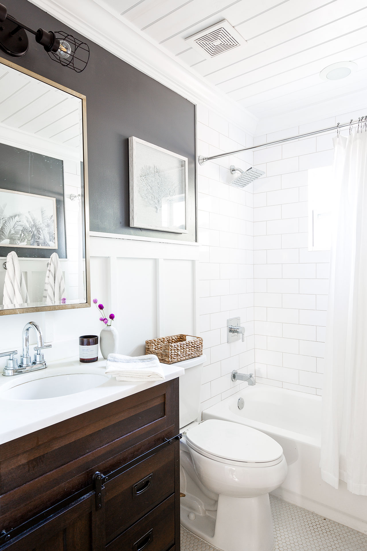
The Guest bathroom was one of the most awful rooms in our first house see the before and after here Link to Post 2. From the strong mold smell, leaky plumbing, and cracked tiles, this room needed to be stripped to the studs and put back together. This bathroom is small but efficient, it also serves as the bathroom for our guests. We needed to up the wow factor while staying in budget!
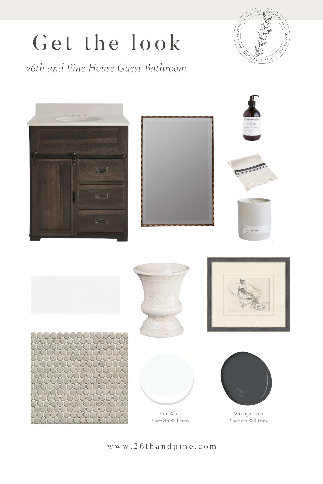
I love the high contrast between Sherwin Williams Pure White and Gauntlet Gray. Adding a high contrast paint color to a small space packs a big punch! Now, let’s talk about subway tile… everyone is using it, it’s affordable, and always a safe option. When using subway tile, mix in a few other interesting elements to keep the timeless trend feeling anything but boring and basic! In this small bathroom I added high contrast paint, fun greige penny rounds and mixed metals. A touch of brass is always a good idea!
The Vanity
The vanity was a great place for us to save money. This vanity was the perfect size and brought in some natural warmth that the room needed. To elevate the piece a bit, I was able to find a marble remnant to switch out the Formica top with.
Pro Tip: Always try to elevate budget finds. Sometimes changing out hardware or in my case a Formica top to a marble top can make a huge difference!
Tile Details
Subway tile is a classic selection that in my opinion, will never go out of style. The key to keeping subway tile fresh, is to try different sizes and layout patterns. We chose to lay the tile in a classic broken joint pattern, but chose to go with a 4×10 size.
For the floor tile, we chose a greige penny round mosaic with a light gray grout. This mosaic is neutral in color but added interest with a slight texture.
Pro Tip: To keep the tile clean and streamlined, we chose to go with a white metal trim edge and had all of our tile joints mitered. This keeps the overall look clean and modern.
Décor
I always try to mix two metals; in this case we mixed the brass wall mirror and nickel plumbing fixtures. Nickel and brass are my favorite to mix, they are both warm metals. For the accessories, I chose to keep it simple, a soft linen hand towel, amazing smelling hand soap (very important) and a luxurious candle to create a spa feeling for all of our guests.
You can view the end result of our guest bathroom remodel here.

Links to Purchase:
